Sunday 22 April 2012

Evaluation - Question 4

How did you use media technologies in the construction and research, planning and evaluation stages?

Throughout the different stages of my A2 coursework I have involved many different types of media technologies to help create a high quality product. Without the use of many of the pieces of equipment and computer software’s I have used the end result would not be at the same standard.

When it came to researching trailers, it was important to get an accurate idea of what codes and conventions were used, so for this I used ‘YouTube’. This website is a popular site for people to share video clips, so this is where I choose to research horror        trailers. In the presentation of our ideas for ‘Evil Awaits’, we show the trailer of ‘The Blair Witch Project’. This was done in order to show our background research of the codes and conventions of a horror film. As well as that it gave us and the audience an insight in what to expect out of a horror trailer. We researched other trailers along with ‘The Blair Witch Project’, however we thought that this trailer best portrayed what we wanted to achieve, due to its low budget techniques as well as fast pace camera shots. ‘YouTube’ became a practical website for researching such trailers. As well as that we used this website to post our final trailer so that we could use this as a link to have a shared viewing of it.


When it came to the actual filming of the trailer we used the Nikon D5000 Digital SLR Camera. This is a high quality camera that allowed us to zoom in effectively to create extreme close up shot, whilst still maintaining a good standard. As well as that it was able to pick up sound whilst recording. This was useful for a couple of scenes, however sometimes we had to record sound over the top of the footage as it didn’t pick it up clearly enough. As well as that during filming we had to ensure that the shots were steady when needed, this was done through the use of a tripod. The stability of the camera enabled us to have effective footage.
When it came to presenting the beginning stages of our film trailer to an audience we used a projector screen. With both the screen and camera being of a good standard, the audience were impressed with the high quality of the footage.


When it came to editing we used the software called Adobe Premier Pro. This allowed us to edit each individual shot when necessary to ensure that it all came together well. As well as that we were able to add tints to the scenes. This convention was something that I found to be a familiar thing that occurred throughout the trailers I had researched. It allowed us to add a darker tint to the scene, this made the shot seem more gloomy and mysterious. On this software we also could have multiple sounds playing at the same time. Although this took some time to get correct, the end result can be seen to be quite effective. Overall this software was ideal for what we required for making our horror trailer.
This print screen shot of our trailer shows one of the techniques that we were able to use on our editing software.With Adobe Premier Pro were were able to use two shots on top of each other. This was done through making the top layer translusant. This helps to create a proffesional look to our trailer.

When it came to producing our ancillary texts to go along with our film trailer the media technology that we used was Adobe Photoshop Pro. This software, similarly to the editing the trailer, allowed us to edit the tint and contrast of the images. As well as that, the editing of the photo itself was easily done on this program due to the different techniques you could use. For instance, on the poster I edited such details as the persons eye to make it darker. This is so that it would make it stand out more substantially as well as making it contrast more with the rest of the image. This program also enabled me to add text in different fonts, sizes, and colours. This is a necessary quality needed for creating a magazine cover or a film poster.  Overall the variety of techniques that are on offer with this program allowed me to create professional looking ancillary texts.

The final main media technology that I used was ‘blogger.com’. This website has allowed me to effectively display my A2 coursework in an organised manor. The functions such as, being able to label my work, title it, keep track of the date posted etc... have all allowed me to ensure that my work is displayed in an organised format. Another thing that the website offers, that I have taken full advantage of, is how easily you can upload photos. This is a vital thing for showing the work I have achieved, as it allows me to give evidence of the research and planning I have done.


Overall I have used many different media technologies to help me to develop my research, planning and evaluation stages. All of the different software’s that I have used have been an essential part of created the professional finish to my products that I have been aiming for.

Evaluation - Question 3

What have you learned from your audience feedback?

Throughout the time of making our film trailer and ancillary text I have made constant reference to audience feedback. This has been done in order to ensure that I have a high quality product as a result. Audience feedback is a vital part of developing our products as it helps to ensure that it is suited to other people as well as getting different perspectives on how it can be improved. This process started from the very initial product in our practice short film, ‘Day in the Life’. Our group saw this as a vital step to take as it helped us to get the general feel of what people looked for in a film. Although this short film is not similar to the end result of our trailer, it was an important learning curb for us. From this point we then went on to have a group decision on what our trailer should be about. This helped us develop more of a target for what we were hoping to achieve, as it allowed us to put forward some of our ideas. As well as allowing us to discuss genre and plot of our trailer, it allowed us to get audience feedback on what techniques they have found to be effective from previous products.

After the initial stages of deciding which direction to head in with aid of our audience feedback, we then put forward our ideas for the plot, setting etc... in a presentation format. The feedback that we received at the end of this had its positive aspects, as well as its negatives. The people that we interviewed both liked the plot for example, Maria Gonzalez said that ‘the story line was very inventive and one that can attract an audience’. As well as Mr Morris saying that he thought ‘the plot was reasonably sound’. From this feedback we did not change the plot greatly, only the areas that we saw to be weaker than others. However the audience feedback from our presentation also gave us some areas of thought. This is because a problem that people thought that we could encounter along the way was location. Mr Morris said an issue that could arise would be whether or not ‘we would be able to find an abandoned house’; this would be where our main scene would take place. From this point we went on further to investigate whether or not this would be doable, this was the result:  Link. The audience feedback from this early stage helped us to consider factors that hadn’t been bought up before; hence, it helped up to ensure it was practical before we went any further. As well as that it highlighted the strong points of our trailer, this is the plot, so we didn’t make radical changes to this as it was seen to be a good idea.

Once we had started our filming we thought that it was important to get some feedback on what we had done so far. This was an effective thing to do as it allowed us to take on board their comments to ensure that the rest of the trailer would be effective. For instance a comment that was made said that, ‘things that need to be improved are the editing between clips and captions’, and that ‘it was too slow during the clip’. This was an important thing that we needed to improve upon. This is because some of the main conventions that a horror film should posses are fast pace camera shots, this helps to build up tension and suspense. After this feedback we then went on to improve the footage through cutting sections down and editing it so it gave a stronger sense of horror. This concept was also mentioned in another piece of feedback through saying that, ‘the length of the one shot does seem a little long for a trailer or though could be used with a supporting voice over to introduce the film's concept to the audience.’ From taking both pieces of feedback into account, we decided to edit the length of some section and to use a voice over at a later stage of the trailer. This can be seen to be done on many accounts throughout the trailer once the rest of the filming was done, hence the audience feedback can be seen to be very effective and useful. Through the use of the audience feedback I have managed to learn from it to help develop my trailer so that it was a better standard of product.

Another prime example of the use of audience feedback is when it came to producing my ancillary products. This has been done for the same reasons that audience feedback was a vital a thing whilst making the trailer; in order to develop my product more towards what the audience saw as being effective. As in the majority of attempts at making either the magazine cover or the poster, I asked for audience feedback after each product. This was important as it allowed me to ensure that my next attempt took on both the negative and positive aspects to develop the product further in the hope of the final piece was strong. For instance in my second attempt at a film poster someone said that it was ‘not very informative’. This made the poster weak in general, as providing enough information is a vital convention that a poster must possess. So in my third and final attempt, information was something that I felt as if I hugely developed to the extent that it had all that was required. This resulted in the final product having strong feedback. I took on the same format for when it came to developing my magazine cover. The final product of the magazine cover was one that was seen as being ‘effective and eye catching’. So due to the general strong feedback and time constraints there was no reason to further develop the cover.

Overall audience feedback was a vital thing that helped me to develop my product. Through taking on the comments I was able to adapt the trailer and ancillary texts to make it something that was suited and liked by the audience.

Friday 20 April 2012

Evaluation - Question 2

How effective is the combination of your main product and ancillary texts?
The combination of techniques that I have used for both my trailer and poster are similar, however the magazine front cover is done in a different way, and this has been done to make each product more effective. The reason that I have approached my main product and ancillary texts like this is due to the fact that they will be targeted at different audiences. Both the trailer and poster would be produced by the same group of people advertising the product; however, this is not the case for a magazine cover. This is because the magazine company would be in charge of producing the cover to suite them as well as adding a different twist. This is done so that they would to appeal to a wider target audience. Because of this I have adapted my products in order to make it more effective and realistic.
The trailer and poster have similar themes to each other as they both portray the spooky horror idea. This is demonstrated through the use of different techniques. For instance, with the trailer we were able to take advantage of the fact we could add suspenseful music to fit in with the fast pace of the camera shots. As well as that we were able to edit the shots to adapt the colouring to make it darker, this further anchors the idea of horror. This then links in well with the poster as this shows photos from shots that are in the trailer, hence combining the two products. This form of advertising was done with a set target audience in mind, the age range of 15 – 25, this gives us a set goal in mind for what we need to achieve. These two products have been targeted towards this age range by the following techniques: showcasing the stars (young actors), setting, plot, dramatic camera shots, voiceovers, editing etc… all of these techniques have been used in a way to appeal to the target audience. These products work well together due to the intertextuality that exists between the two.
Through saying that the magazine cover is done on a separate basis is untrue due to similarities that it has, this is essential for advertising the film. Intertextuality exists between the products through the promotion of the main character, review quotes, and the dark atmosphere. The differences that occur between it is the use of different font, different images (although this character is shown in the trailer), a general new theme has been used to create a different effect. Although the magazine
company, ‘Exclusive', would still wish to portray the horror theme, they need to appeal to a larger target audience to be able to sell their magazine rather than just the film. This is the reason that it has been designed in a different manor. Ideally there would be more similarities between the magazine cover and the poster/trailer, in order for them to be linked more effectively, I still feel as if it is a successful and effective product.

Monday 16 April 2012

Evaluation - Question 1

In what ways does your media product use, develop or challenge forms and conventions of real media products?

The media products that I have produced can be seen as following the forms and conventions of real media products. This can be mainly seen throughout the genre that we have chosen. Genre is something that can be seen as a basic level of communication between the encoder and decoder, as it is the encoder’s responsibility to ensure that the conventions of the chosen genre are met to the decoder’s expectations. This is established through key elements that are used frequently throughout a number of different methods. In my research I outlined the main conventions of a film trailer, this helped me to ensure that we included the main qualities in my trailer (link to the trailer convention research). The main conventions of the film trailer are shown below, as well as how they help anchor the horror genre:


Iconography has been used with the abandoned house. As this clip shows the teenagers approaching the building. Iconography is something that belongs to a genre, e.g. a prop or setting. The abandoned house scene is something that can easily be linked with horror films. The mis-en-scene helps to create an element that results in matching the conventions of other products. Showing the main setting of the trailer is a common convention that has been used in all previous products. Because of this, having an establishing shot of the abandoned house is a vital quality for our trailer. The low close up camera shot at the beginning of this clip showing the teenagers walking, builds up tension, and further increases tension. 


Another convention that clearly shows the genre  of horror is the music. Music is a vital convention that is in all the trailers that I have done in my research.The music throughout the trailer is full of suspense and drama; I have chosen a clip from the trailer as the music has built up to match the anticipation that is going on in the footage itself. This helps to anchor the genre.


This clip shows our use of different camera angles to create a professional looking trailer. At the beginning it shows a tracking long shot of three girls sitting on a bench. This has been done so that it establishes the scene as well as showing the characters. This is important so that the audience gets to know the characters. The camera angles help the characters/trailer to be more likable. The next shot shows a low camera angle looking up at the abandoned house. This low shot is significant as it signifies how big and powerful the building is, resulting in the audience feeling small. The next significant shot in this clip is a medium shot of the three people talking. This is a good and effective way of showing the conversation.


This clip shows examples of how we have adapted the use of conventions into our trailer. At the beginning it shows a blacked out screen with text saying 'THIS WINTER', this is what the voice over also says. This convention is a quality that is shown in many other trailers, so we saw it important to include it in our footage. As well as having a voice over the top of the footage, I have also given an example of how we have involved sound. The screams that have been edited into the trailer anchors the genre, as well as fitting well in with the footage.

The genre horror has been chosen for our trailer mainly due to the fact that we felt we could match the qualities that are needed for it better than any other genre. As well as that we felt that the genre fits the target audience more specifically, as horror films are more commonly watch by people aged 15-25. We felt that people can relate to our film by the fact that the characters are the same age as our target audience (this was obviously a practical decision, as our group have done the acting), as well as the plot being something that is common for people of this age range, exploring and getting into difficult situations. This has resulted in our genre being the perfect fit for what we were aiming to achieve.

The generic textual features of our 3 products have occurring themes within them that relate them to other products similar to them. This can be shown by the creepy setting, basic themes that are related to horror films, as well as the plot following the normal conventions.

Through the use of research on both my magazine front cover and poster I was able to use specific techniques used ensure that they reflected accurately what is required whilst still maintaining a horror theme. The poster that I produced has the normal conventions that any other poster has and requires. This is demonstrated by the use of a bold title that is the main focus of the product, as well as, relevant images, release date, reviews, and a strong representation of the theme of the trailer. All of these elements help to anchor the horror theme that is necessary when it comes to advertising such a film. My magazine front cover also achieves this with the use of the conventions of any other product likes it. This is done through the title, selling of inside articles, main focus image, strapline etc…. All of these elements help to produce a magazine cover that reflects accurately other real media products.

I have compared my magazine cover to an existing product, this demonstrates the basic codes and conventions that both products have:
Overall the three products that I have produced have been developed through the use of other real media products like them. The research that took place before starting each piece helped me to create an accurate reflection of what the real product would look like. This has helped through the essential conventions that I have interpreted in my own way to produce a product that is specific to my film, ‘Evil Awaits’.


Friday 30 March 2012

Final Film Magazine


This final magazine cover demonstrates a use of many techniques that have resulted in a product that is 'effective and eye catching' (audience feedback quote). This can be seen as effective due to the fact that it possess all of the qualities that a magazine cover should have. For instance it clearly advertises the articles that are inside the magazine, hence enticing the audience to buy the magazine. Another interesting quality that it has is the use of more than just the one picture. Although, only the main picture is for the film that I am focusing on, there is a film strip advertising the 'Free trip to the Harry Potter set'. This is seen to be done in many other film magazines, as this further entices the audience. Like in the draft of my magazine cover, I have also done a strap line in this cover. I see it as an important quality as it promotes the magazine itself as well as making it stand out. The magazine can also be seen as eye catching due to its contrasting colours which make it stand out. This is important as this will help to sell the magazine. As well as using the technique of the one main image being the focus, I have also used the image of trees to link it back to both the trailer and the film poster. It is important to make the link between these 3 products. The way in which the trees are faded in the background is effective due to the fact it links back to the film itself, it does this in a subtle manor so that its is a simple background, this makes it more eye catching. Although it is a 'well made product that advertises the film well' (audience feedback quote), 'the way in which the text is done could be improved' (audience feedback quote). Making some of the text clearer would be how I would improve this magazine cover, however, due to time restrictions, this was not possible to do. However, overall, this magazine cover sells our film trailer for 'Evil Awaits' well due to its 'striking appearance' (audience feedback quote).

Tuesday 6 March 2012

Initial Film Magazine


This is a simple first attempt at my film magazine cover as it contains the basic qualities that other covers have. From my research of other film magazines the style of having the main character of the film that they are featuring as the main focus of the product is common, hence I am also taking on this style for my front cover. The text that I have included is also in the same style that I have seen in previous covers, for instance the way in which the title is partially covered by the image and also the advertisement of articles within the magazine is a theme that are in other magazines.  The strap line at the top of the page makes it more eye catching due to its boldness. As well as having a set style brewing is important. For instance the 'plus' and 'free' being in capital letters as well as being bold makes it have a little bit more personality. Although this is only a basic draft it gives me a good starting place in which to develop it further as it has all the simple things that are required. In my next attempt I will make it more eye catching and bold.

Friday 2 March 2012

Research for Magazine Film Magazine Front Cover

The next form of advertising for our film trailer that I am going to produce is a magazine front cover, as this is a vital way of accessing the public and making our film known about to the right group of people, as people who would buy a film magazine would be interested in films and hence they become the perfect audience for our advertising. Before I begin designing this form of advertisement it is important to research into other existing film magazines, this is so that I learn of the basic techniques that are used as well as knowing what is required on such a piece.

What attracted me most about this film magazine is how the image overlaps the actual name of the magazine; however it is not completely covered. This technique used is effective due to the fact that it makes the photo standout, this is an important quality that I would want my film magazine to have, this is because it focuses on the film advertising, this is obviously what I am hoping to achieve by doing this piece. This photo is of the main character from the film advertised, this is I have noticed with other film magazines as well, this demonstrates how it is not usual for a scene or numerous characters to be on the front page, this technique is something that I intend on doing on my own product. The title of the film is also a main focus point for this front page due to its large font, this makes it eye catching. This front page also has tags saying what other articles are going to be inside of the magazine, this selling technique is effective as it makes the audience want to read more. The way it says '10 coolest movies being made right now!', this is something that a movie fanatic would want to read about, but with the exclamation mark at the end, it makes it seem more exciting and thrilling, this is also done with other words on the page such as 'EXTRA!' and 'SNEAKY!'. The text that says 'world exclusive' is further advertising for both the magazine and the film as it shows this magazine as being the only magazine having information on this film. This front page also shows other pictures of what is going to be inside the magazine, this along with all of the other techniques used, makes this an eye catching and interesting film magazine.


This different film magazine front cover is seen to have the same techniques as the one above, this demonstrates how there is a set format that the majority of magazines undertake. However there are some differences that makes this magazine individual and interesting, these similiarites and differences are outline below:

Codes and Conventions of Magaznes


Here are the main codes and conventions and what they look like on an existing products. This piece of research will be useful when it comes to making my magazine cover, as it shows what necessities are required to have a high quality finish.


Masthead:


Release date, Issue number and cover price:


Feature article photo:


Articles inside the magazine being advertised:


Strap line:

Final Film Poster


This is my final product for my film poster for 'Evil Awaits'. I feel as if this is the best and most eye-catching out of all of my attempts as it is unusual as well as getting across the message of the film by demonstrating its genre, this is achieved through the general gloom of the whole poster. The quotes at the bottom of the page helps to draw the audience in as it has be proven by film critics that it is a successful high quality film. The standard of which IT skills have been used make it more effective. The techniques that I have used in this poster have all been used before, e.g. the images have all been used in previous attempts, as well as having reviews etc... this shows progression and how I have used previous faults to develop the poster. I have asked a few people what their opinion is of the poster and how effective they think it is, they are quoted below:

'Effective and high quality images'


As I have mentioned previously, these images have been used in the previous attempts at a film poster, however I feel as if they work best in this format. This is due to the different IT skills that I used to make them more effective, for instance the image of someone staring through the title. This technique is effective as it adds an interesting twist to the poster as it is unusual (this idea was taken from my film poster research). As well as that, the black block has been blurred into the image above, this was done so that its not as bold, this also makes it flow better with the rest of the poster. This also provides a solid background for the text.


'Over crowded but informative'


Although it can be considered over crowded, it contains all of the important qualities that a film poster needs. For instance it contains reviews, a release date, images, rights of the film and film title. All of these qualities are necessary advertising on a film poster, therefore they have been arranged in an effective manor. If I was to further develop this product, the overpowering images is what I would change. All though they are a vital part of the poster and help to portray the genre of the film effectively, I would want them to be slightly more subtle. However, due to time constraints I do not have time to do changes such as this one. In spite of this, the poster still comes across as being effective and high quality.

Thursday 1 March 2012

Mock-Up for Final Film Poster


This is a mock-up for my final film poster design; this will give me a better precise idea of what I hope to achieve through the making of this product.

Friday 24 February 2012

Further Attempt at the Film Poster


 Since I am nearing the end of the design for the film poster, I have decided to get some audience feedback on this attempt, to ensure that I have the best possible result for my final piece.

               'Layout is interesting and eye-catching'

This quote from my audience feedback is important as it emphasises the progress made from my first attempt as it shows how my design as a film poster is becoming more appealing to the audience. The layout is seen to be effective due to the way in which the character comes from behind the building. Although the character is situated behind the building, it is a strong enough photo not to be washed out and become a significant part of the poster. The positioning of the text also standouts, even though the majority of research posters have the text central, having it at the bottom of the page is just as effective.

               'The text is effective since it standouts. The review given is simple but effective'

This piece of audience feedback shows the effectiveness of the bold title, as the white text contrasts to the black background. Although this is an obvious choice in colouring (in order to make the title standout) it works well for the genre as it adds to the whole darkness of the genre. The font that has also been chosen here is valuable as it is done in a gothic format, the font is important when controlling the effect it has upon the text as the straight bluntness of the title emphasises the serious and non comical theme that is within the film. The review that is given within this film poster is short and snappy; this would help to get the point across about the quality of the film. Although it is just a star rating, rather than a quote, it still has the same effect.

               'It is not very informative'

This is an important point being made as although the poster doesn't have much text on it, and can be seen as effective because of that, it does not have enough. This is because it doesn't have any of the actor’s names or a release date. From my research it can be seen that this is a necessity and it is an important thing that I am missing from this design.

Tuesday 21 February 2012

Initial Film Poster

This initial design for my film poster was not successful for many reasons, all of which have been reflected in my audience feedback on this piece. However saying that, there are some positive aspects to this work, for instance the way the poster reflects the genre of the film, due to the darkness of the abandoned house and the contrast in the trees it achieves the dark mysterious atmosphere that is also reflected in the trailer. Although it has been pointed out by one of the people reviewing this piece that the darkness has resulted in a flaw in this poster. This is because in all of the research posters the title has been the main focal point of it and it has always stood out significantly, this does not come across in my first attempt at the film poster. Nevertheless I am pleased with the photo of the abandoned house as it sets the scene for the film, however it is rare not to have a photo of at least one character on the poster, this is one way that I hope to develop my poster in my next attempt.

Friday 27 January 2012

Planning the Poster for Our Trailer

Now that our trailer is completed and we as a group have edited it to that extent that our complements have been enhanced and faults fixed, the next form of advertising that I as an individual intend on producing is a film poster. (I have posted a previous piece of text on how a poster is a vital piece of advertising when it comes to promoting a film; this is the link to this text).

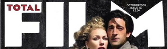
Before starting the planning of the poster the analysis of other film posters are vital, as this will help in understanding the techniques used, as well as things such as they layout and information provided.


This film poster for 'The Descendants' has a very common layout of major films; this is due to its focus on the one large photo with little text. This format is seen to be quite effective due to the simplicity of it, whilst at the same time showing what type of film it is going to be. Due to the vibrant colours in contrast to the sadness upon the mans face the audience may get the impression that it a story about loss and emotion. Another common technique that has been used in this poster is the focus on the main star of the film, 'George Clooney', this is done through the mention of his name (amongst the small amount of text on this poster), as well as having him as the focal point of the poster. This gives the impression that it is a high class film as the lead is a famous actor. Whereas on posters where the there aren't any famous actors there is often less focus on the actors, more on the background etc.


This film poster for 'Last Nights' uses different techniques in comparison to 'The Descendants'. The main difference is the fact that it is not focused on one picture, it has four all the same size, hence not drawing more attention to one rather than the others. This is important to consider as it allows the audience to know about the characters and actors in the film. The title in this film is in a different positioning to the other poster, as it is centralised at the bottom of the page, this shows how the title doesn't have to be in the middle of the page to make it stand out. The main technique that has drawn me to this poster is through the use of review quotes, e.g. 'thought provoking and stylish'. This makes the poster stand out as it lets the audience know other peoples view on the film before they have even viewed it, this is a very strong way of advertising a film on a poster as it gives more information on the film through a still image.

'The Ring' is a horror film, which is portrayed clearly in its poster through the general darkness and mysteriousness of it all. This is something that I will need to take into consideration when making my own film poster for my trailer, as I will be using similair techniques to portray it as a horror film. Through the use of light contrast it creates the a very strong image as it reflects the true darkness of the film. The use of review quotes are also used within this, which helps to further create tension, it also helps the film to reach its right target audience. The image that is within the title, is also a very horrific way of presenting a title, this technique can be seen as very effective through how unusual it is to see the title done in this way.

Saturday 21 January 2012

Explanation of my Photos and How I Have Edited Them

Whilst filming our trailer we also took some pictures to be used for our poster and magazine front cover that we are going to produce. These are a sample of the pictures that we took and how they are going to be useful when producing the further two forms of advertising. The photos show before and after editing shots:


The photos that I have taken here I feel as if will be a useful when it comes to producing my magazine cover and film poster. This is due to the fact that it is a shot of the main setting of the trailer. This will help to create a link between the three products. As well as the dark and contrasting shades that I have edited into it show the house as being more dilapidated and mysterious. This will help attract the right audience due to the fact that this emphasises the horror theme. As well as that I have edited in a white background behind the house. This will allow me to put another picture/text behind it. This will help to create a more professional look finish to my poster once it has been fully developed.

This shot of the person staring at the camera behind her hair, once edited, creates a spooky effect. Due to the fact that you are unable to see her whole face, it creates an unknown and tense atmosphere. This photo will also help link the ancillary texts back to the film trailer since this character is shown in it. Especially on the film magazine front cover, it is an important to showcase the main stars of the film, as this can be seen as a key selling point. As well as achieving that, this photo also manages to emphasise the genre.
Similar to the over two sets of photos, these shots of the trees help to further anchor the atmosphere as a horror since the forest is a scene that is often used in a horror film. The way in which I have edited the photos help to give the impression of a thriller. Due to the black and white contrast that I have used in this photo, it creates a spooky tone that will go well in my poster or magazine cover.