Friday 30 March 2012

Final Film Magazine


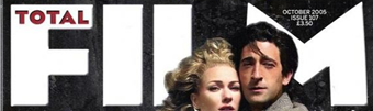
This final magazine cover demonstrates a use of many techniques that have resulted in a product that is 'effective and eye catching' (audience feedback quote). This can be seen as effective due to the fact that it possess all of the qualities that a magazine cover should have. For instance it clearly advertises the articles that are inside the magazine, hence enticing the audience to buy the magazine. Another interesting quality that it has is the use of more than just the one picture. Although, only the main picture is for the film that I am focusing on, there is a film strip advertising the 'Free trip to the Harry Potter set'. This is seen to be done in many other film magazines, as this further entices the audience. Like in the draft of my magazine cover, I have also done a strap line in this cover. I see it as an important quality as it promotes the magazine itself as well as making it stand out. The magazine can also be seen as eye catching due to its contrasting colours which make it stand out. This is important as this will help to sell the magazine. As well as using the technique of the one main image being the focus, I have also used the image of trees to link it back to both the trailer and the film poster. It is important to make the link between these 3 products. The way in which the trees are faded in the background is effective due to the fact it links back to the film itself, it does this in a subtle manor so that its is a simple background, this makes it more eye catching. Although it is a 'well made product that advertises the film well' (audience feedback quote), 'the way in which the text is done could be improved' (audience feedback quote). Making some of the text clearer would be how I would improve this magazine cover, however, due to time restrictions, this was not possible to do. However, overall, this magazine cover sells our film trailer for 'Evil Awaits' well due to its 'striking appearance' (audience feedback quote).

Tuesday 6 March 2012

Initial Film Magazine


This is a simple first attempt at my film magazine cover as it contains the basic qualities that other covers have. From my research of other film magazines the style of having the main character of the film that they are featuring as the main focus of the product is common, hence I am also taking on this style for my front cover. The text that I have included is also in the same style that I have seen in previous covers, for instance the way in which the title is partially covered by the image and also the advertisement of articles within the magazine is a theme that are in other magazines.  The strap line at the top of the page makes it more eye catching due to its boldness. As well as having a set style brewing is important. For instance the 'plus' and 'free' being in capital letters as well as being bold makes it have a little bit more personality. Although this is only a basic draft it gives me a good starting place in which to develop it further as it has all the simple things that are required. In my next attempt I will make it more eye catching and bold.

Friday 2 March 2012

Research for Magazine Film Magazine Front Cover

The next form of advertising for our film trailer that I am going to produce is a magazine front cover, as this is a vital way of accessing the public and making our film known about to the right group of people, as people who would buy a film magazine would be interested in films and hence they become the perfect audience for our advertising. Before I begin designing this form of advertisement it is important to research into other existing film magazines, this is so that I learn of the basic techniques that are used as well as knowing what is required on such a piece.

What attracted me most about this film magazine is how the image overlaps the actual name of the magazine; however it is not completely covered. This technique used is effective due to the fact that it makes the photo standout, this is an important quality that I would want my film magazine to have, this is because it focuses on the film advertising, this is obviously what I am hoping to achieve by doing this piece. This photo is of the main character from the film advertised, this is I have noticed with other film magazines as well, this demonstrates how it is not usual for a scene or numerous characters to be on the front page, this technique is something that I intend on doing on my own product. The title of the film is also a main focus point for this front page due to its large font, this makes it eye catching. This front page also has tags saying what other articles are going to be inside of the magazine, this selling technique is effective as it makes the audience want to read more. The way it says '10 coolest movies being made right now!', this is something that a movie fanatic would want to read about, but with the exclamation mark at the end, it makes it seem more exciting and thrilling, this is also done with other words on the page such as 'EXTRA!' and 'SNEAKY!'. The text that says 'world exclusive' is further advertising for both the magazine and the film as it shows this magazine as being the only magazine having information on this film. This front page also shows other pictures of what is going to be inside the magazine, this along with all of the other techniques used, makes this an eye catching and interesting film magazine.


This different film magazine front cover is seen to have the same techniques as the one above, this demonstrates how there is a set format that the majority of magazines undertake. However there are some differences that makes this magazine individual and interesting, these similiarites and differences are outline below:

Codes and Conventions of Magaznes


Here are the main codes and conventions and what they look like on an existing products. This piece of research will be useful when it comes to making my magazine cover, as it shows what necessities are required to have a high quality finish.


Masthead:


Release date, Issue number and cover price:


Feature article photo:


Articles inside the magazine being advertised:


Strap line:

Final Film Poster


This is my final product for my film poster for 'Evil Awaits'. I feel as if this is the best and most eye-catching out of all of my attempts as it is unusual as well as getting across the message of the film by demonstrating its genre, this is achieved through the general gloom of the whole poster. The quotes at the bottom of the page helps to draw the audience in as it has be proven by film critics that it is a successful high quality film. The standard of which IT skills have been used make it more effective. The techniques that I have used in this poster have all been used before, e.g. the images have all been used in previous attempts, as well as having reviews etc... this shows progression and how I have used previous faults to develop the poster. I have asked a few people what their opinion is of the poster and how effective they think it is, they are quoted below:

'Effective and high quality images'


As I have mentioned previously, these images have been used in the previous attempts at a film poster, however I feel as if they work best in this format. This is due to the different IT skills that I used to make them more effective, for instance the image of someone staring through the title. This technique is effective as it adds an interesting twist to the poster as it is unusual (this idea was taken from my film poster research). As well as that, the black block has been blurred into the image above, this was done so that its not as bold, this also makes it flow better with the rest of the poster. This also provides a solid background for the text.


'Over crowded but informative'


Although it can be considered over crowded, it contains all of the important qualities that a film poster needs. For instance it contains reviews, a release date, images, rights of the film and film title. All of these qualities are necessary advertising on a film poster, therefore they have been arranged in an effective manor. If I was to further develop this product, the overpowering images is what I would change. All though they are a vital part of the poster and help to portray the genre of the film effectively, I would want them to be slightly more subtle. However, due to time constraints I do not have time to do changes such as this one. In spite of this, the poster still comes across as being effective and high quality.

Thursday 1 March 2012

Mock-Up for Final Film Poster


This is a mock-up for my final film poster design; this will give me a better precise idea of what I hope to achieve through the making of this product.